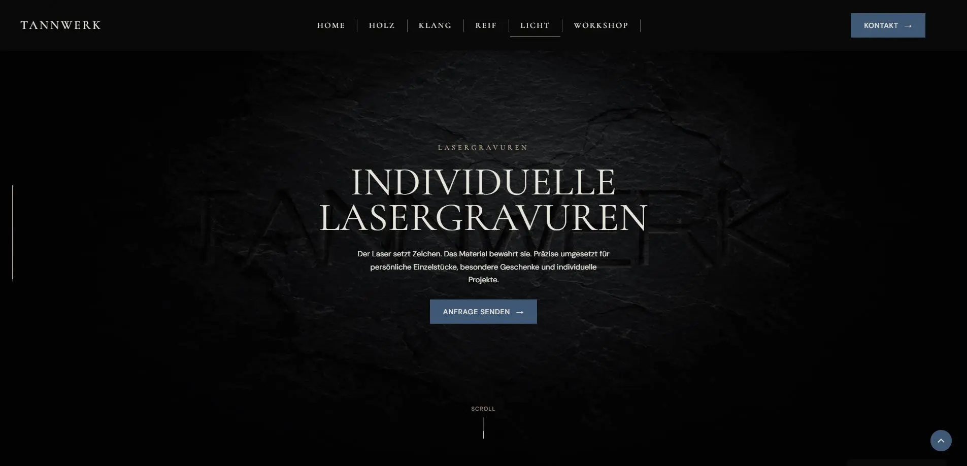
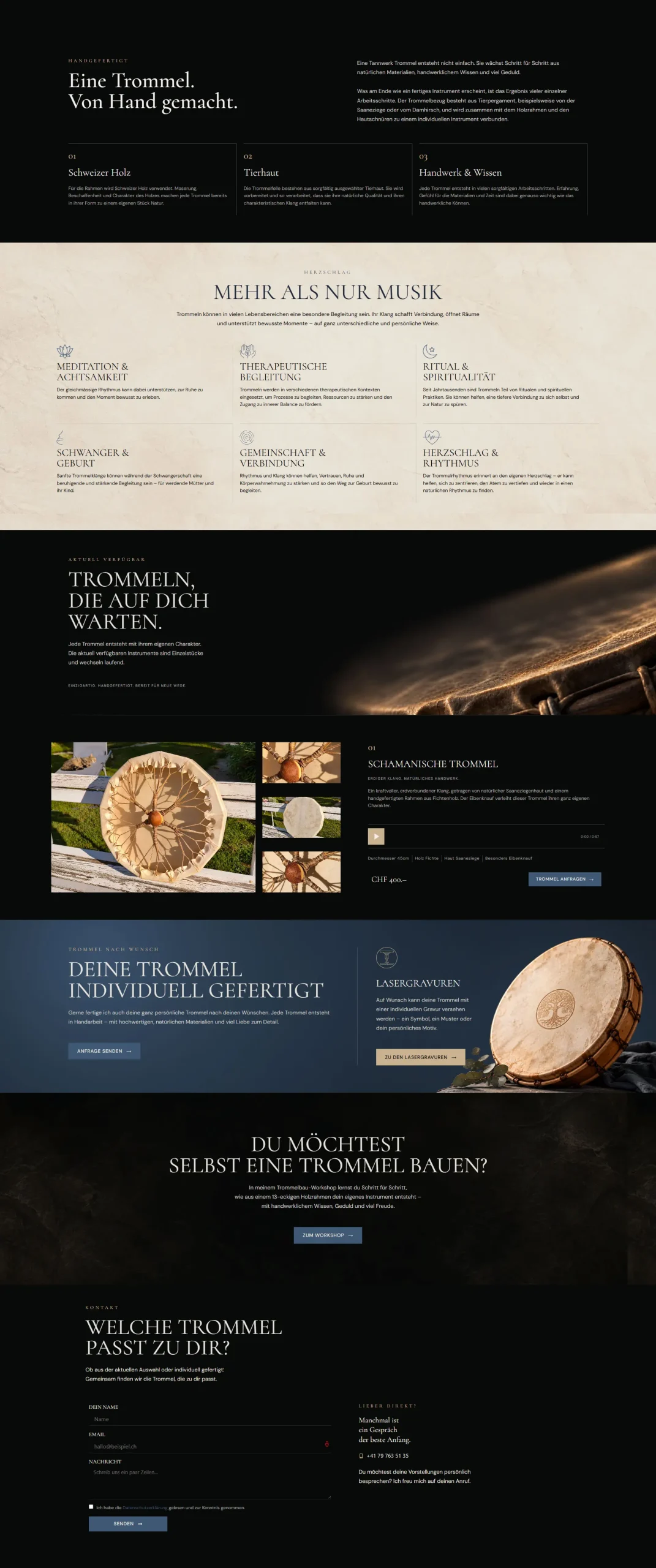
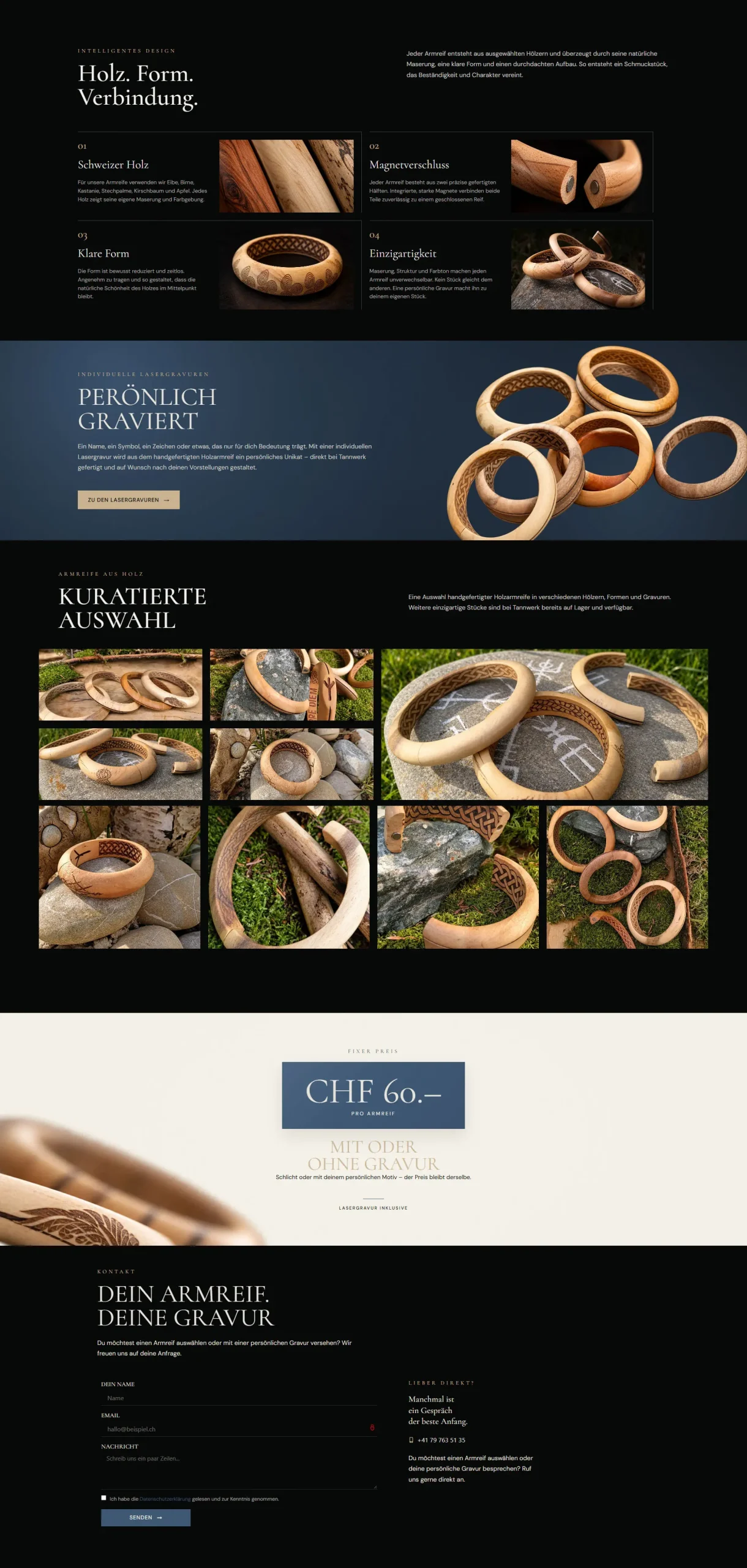
Tannwerk

ANIMATED SECTIONS / SCROLL ANIMATIONS / PHOTO / COPYWRITING

Tannwerk Website für einen Schweizer Schreiner und Handwerker – Webdesign von EF Webdesign

Craft / Joinery

SECTOR

Redesign

Scope

7

Pages

2026

Year

Elementor/HTML/CSS/JS

Built with

Photos/Copywriting

Content

Concep/Design/Development

Services

Live

Status

THE PROBLEM

An overloaded
and unclear
website.

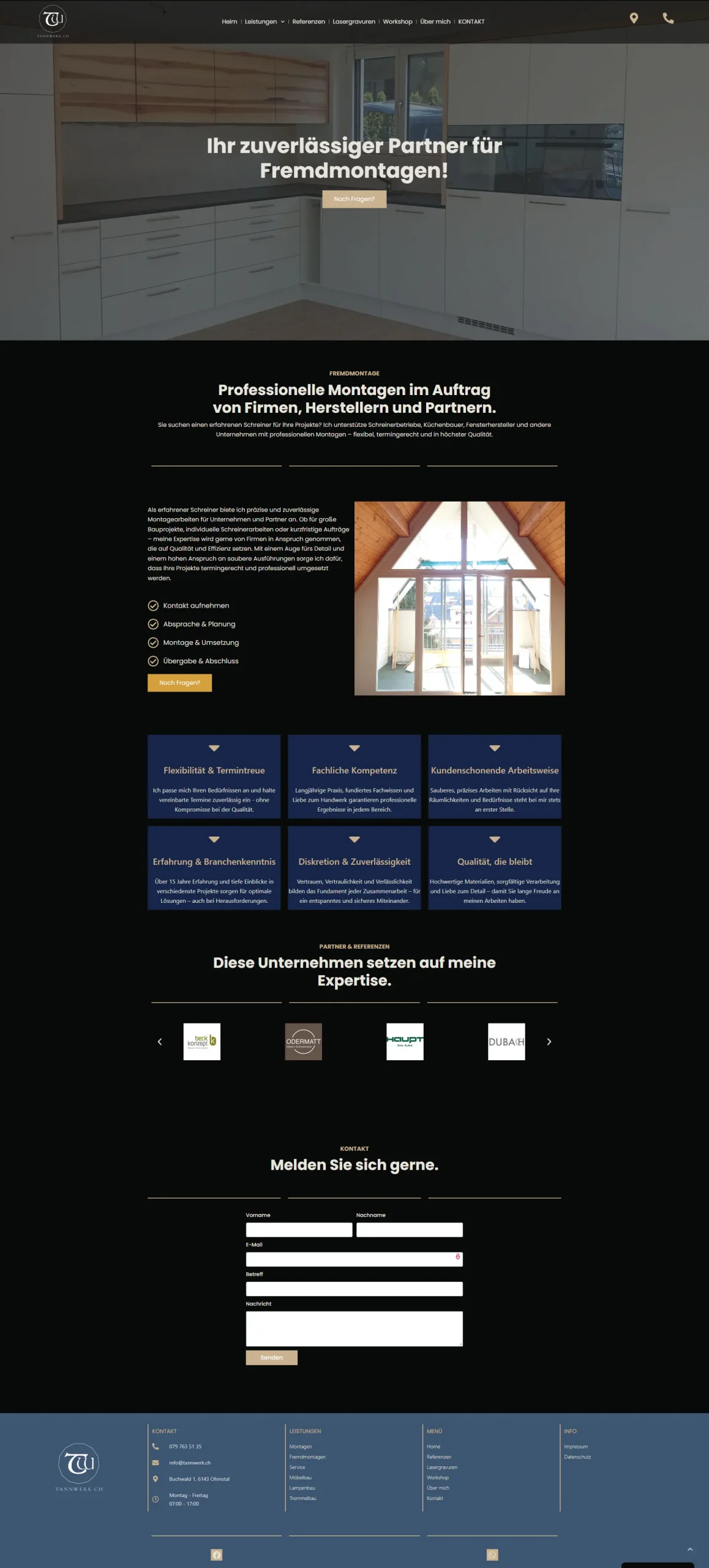
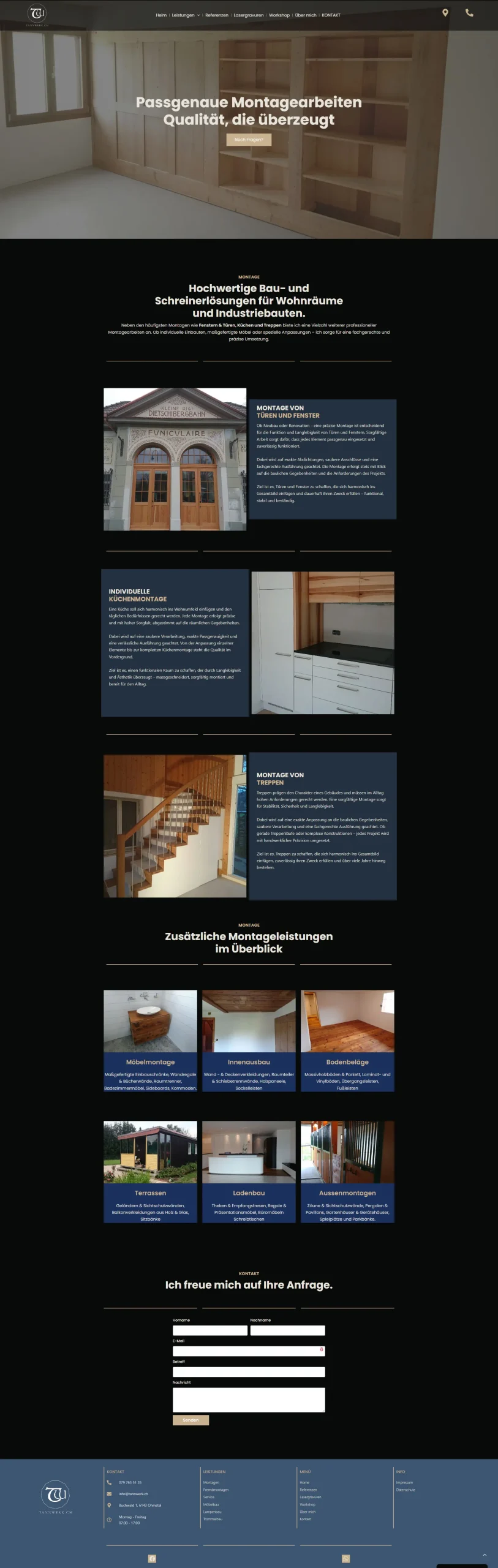
The previous website was divided into numerous individual service pages, with overlapping content and no clear hierarchy. The structure made it difficult to understand what Tannwerk actually offers, while the visual language felt inconsistent and disconnected from the character of the brand.

THE THINKING

Less complexity.
More clarity.

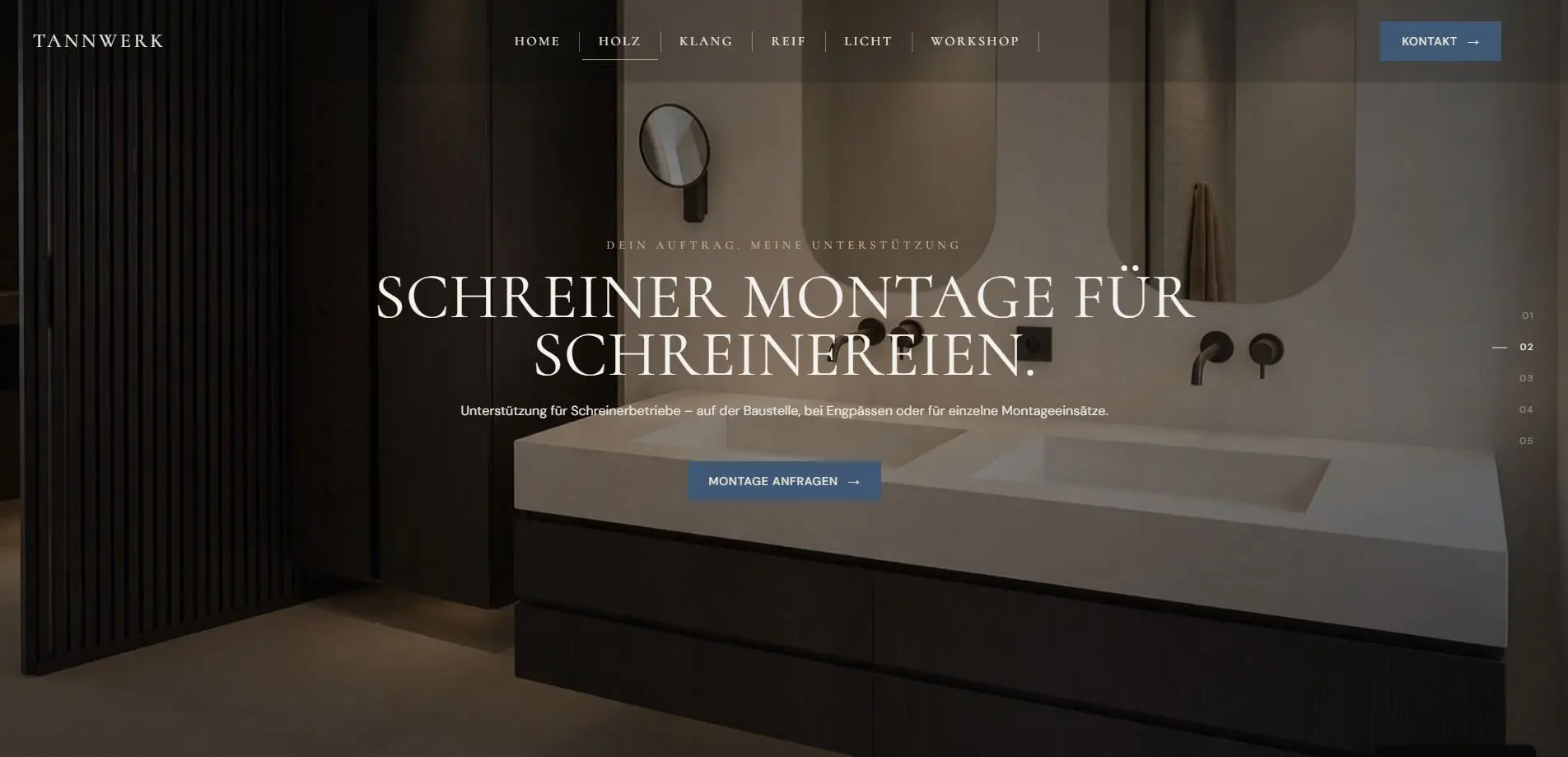
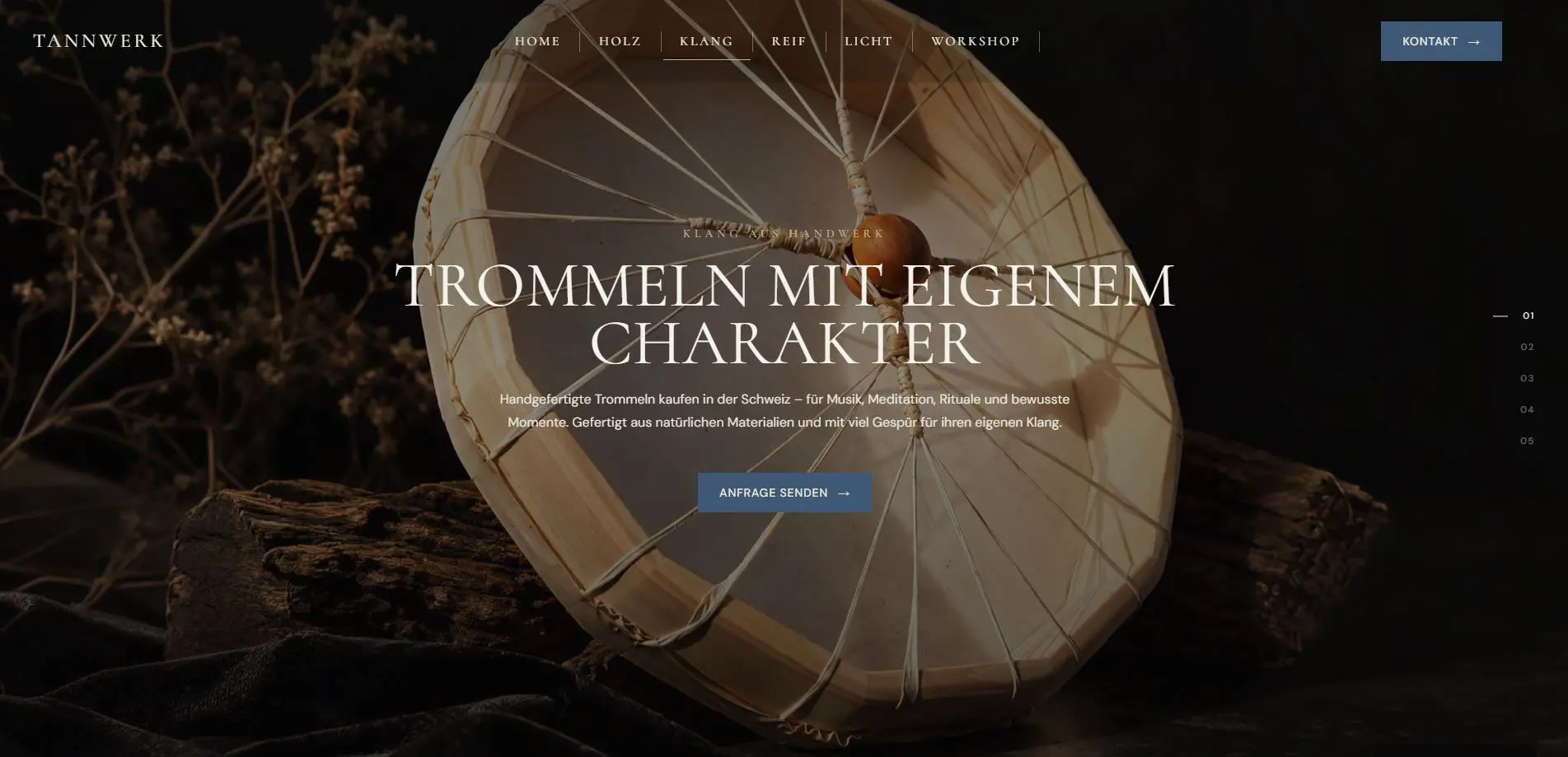
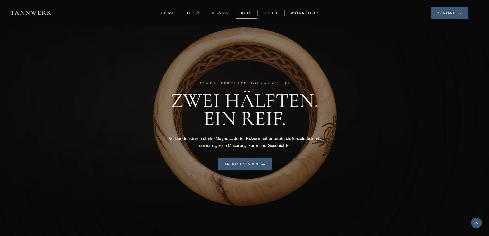
We rethought the entire structure from the ground up. Instead of presenting every service separately, we reduced the content to four distinct areas — Holz, Klang, Reif and Licht — and built the experience around them. The goal was not simply to redesign the website, but to create a clearer digital expression of what makes Tannwerk unique.

THE RESULT

A clear and
immersive
digital brand.

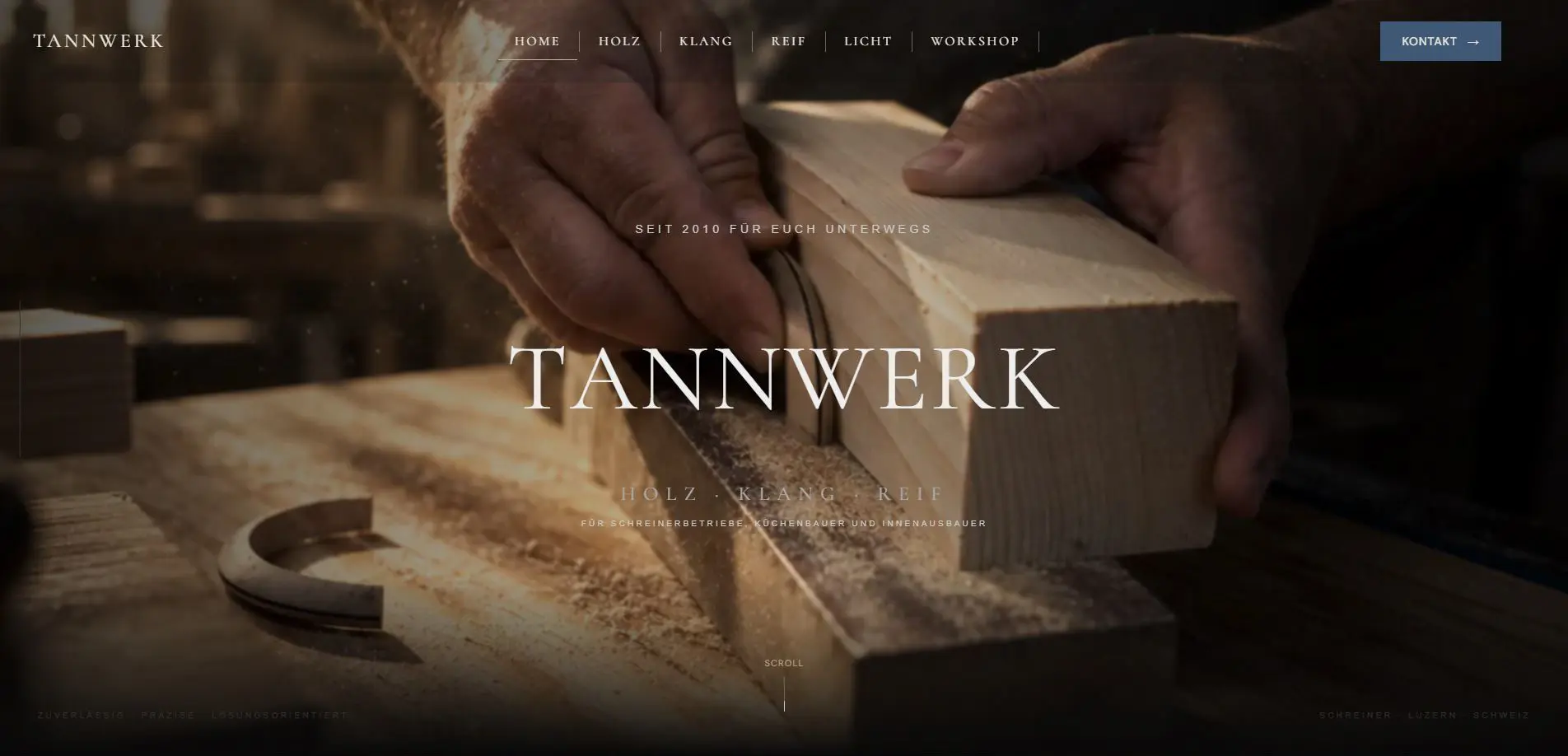
The new website combines a refined visual language with a clear and intuitive structure. The four core areas can now be discovered as distinct parts of the Tannwerk world, while interactive details and carefully curated imagery bring the materials, craftsmanship and atmosphere to life.

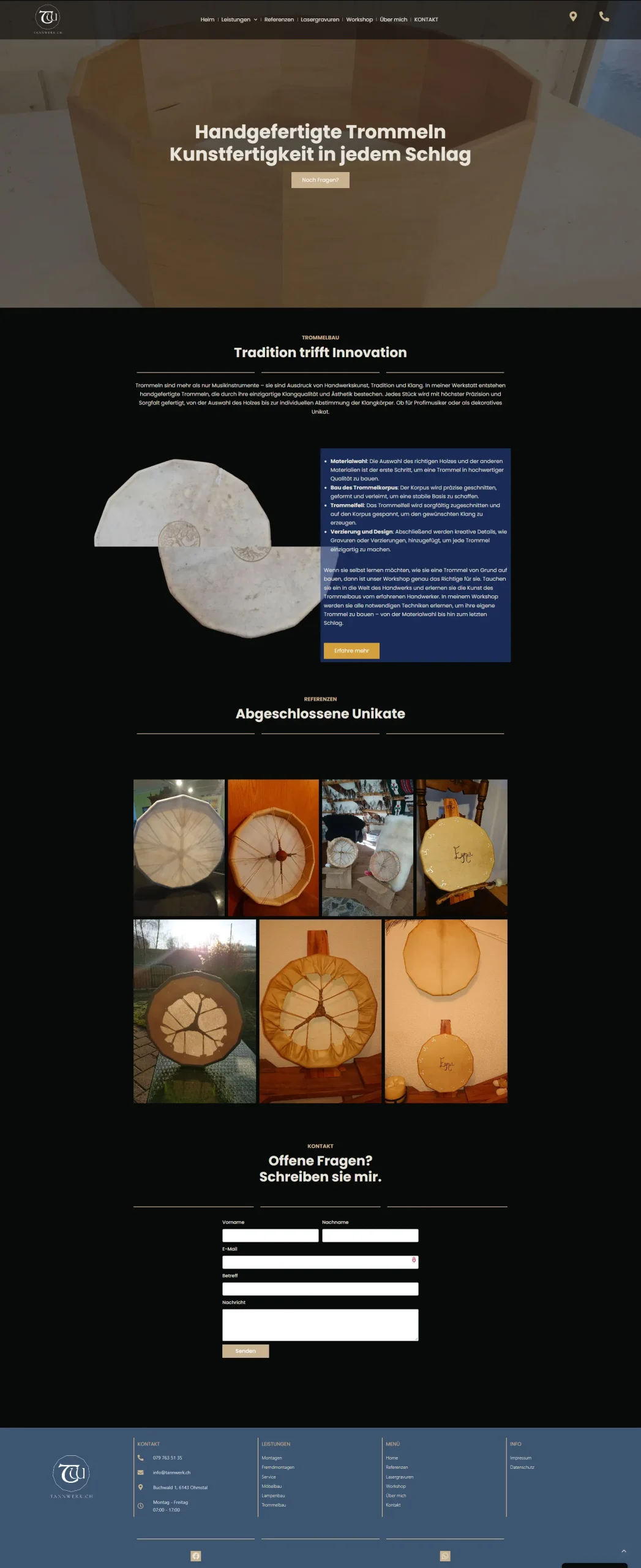
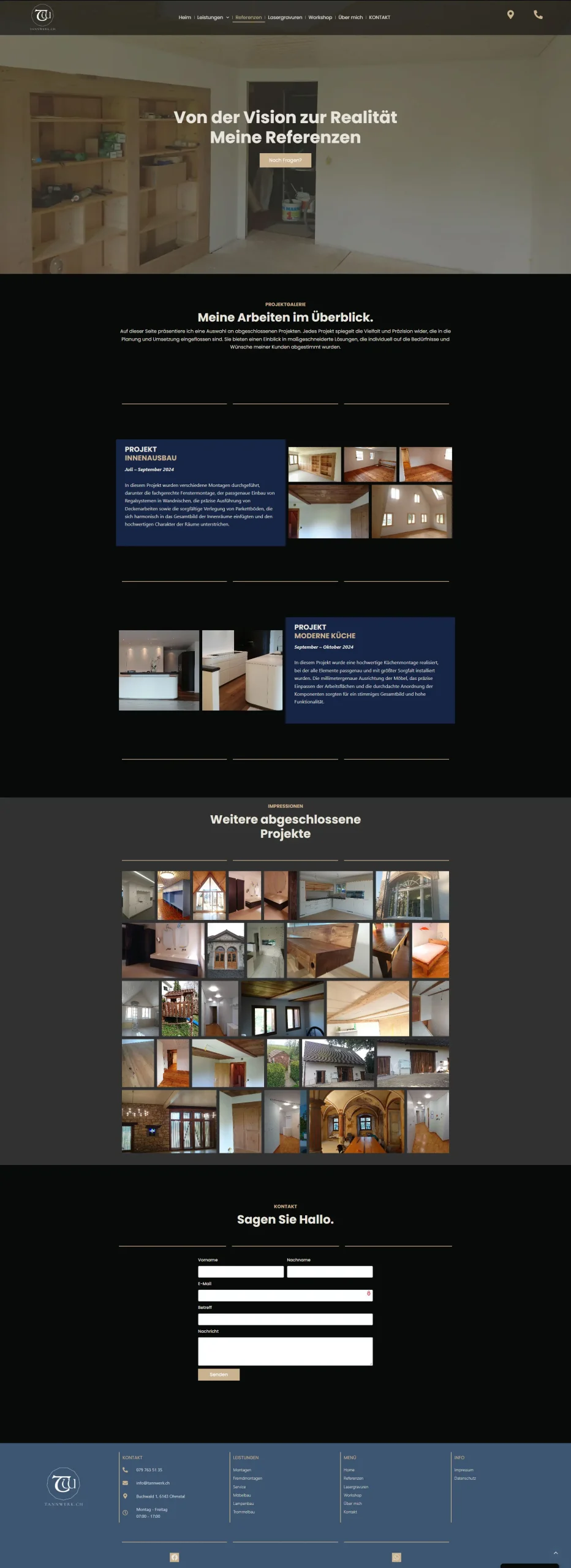
Excerpt from the previous Website

CASE STUDY

A closer look at the new Tannwerk

From structure and storytelling to
interaction and responsive design — a
closer look at the decisions that shaped
the new digital experience.

01 STRUCTURE

From many individual services to four clear worlds.

Instead of presenting every service as a separate part of the website, we brought Tannwerk’s diverse work together into four distinct worlds: Holz, Klang, Reif and Licht. Each area has its own character while remaining part of one connected experience.

02 EXPERIENCE

From a static website to a more immersive experience.

Subtle animations, scroll effects and dynamic transitions bring the new Tannwerk website to life. Movement guides the user through the content, creates visual connections between sections and adds depth to the experience — without distracting from the information itself.

03 VISUAL IDENTITY

A stronger visual identity for Tannwerk.

The new design creates a more distinctive visual language for Tannwerk, combining refined typography, carefully selected imagery and a consistent visual system. Every element is designed to feel connected to the character of the brand while giving the website a more contemporary and recognisable presence.

04 VISUAL SYSTEM

A natural and
refined visual language.

The colour palette and typography reflect Tannwerk’s connection to natural materials, traditional craftsmanship and contemporary design. A calm, earthy base is combined with muted blue tones, creating a timeless and authentic visual identity.

COLOUR PALETTE
#080909
Deep Black
Primary background
Strong contrast
#E7E4DC
Warm Ivory
Primary light background
Content areas
#AAA7A0
Stone Gray
Secondary text
Borders & dividers
#C9B28F
Warm Sand
Primary accent
Buttons & highlights
#3F5875
Slate Blue
Secondary accent
Sections & details
#657D98
Dusty Blue
Supporting accent
Icons & elements
TYPOGRAPHY
Cormorant
HEADLINES
ABCDEFGHIJKLMNOPQRSTUVWXYZ
abcdefghijklmnopqrstuvwxyz
0123456789
DM Sans
BODY TEXT, NAVIGATION, UI
ABCDEFGHIJKLMNOPQRSTUVWXYZ
abcdefghijklmnopqrstuvwxyz
0123456789
05 LOGO DESIGN

From Tanner to Tannwerk.

The new Tannwerk logo brings together the name, the craft and the story behind the brand in one distinctive mark.

A name becomes a symbol.

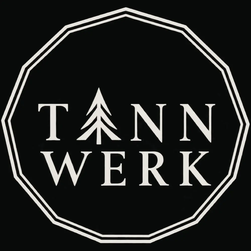
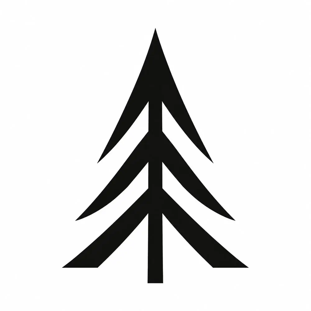
Tannwerk is derived from Stefan Tanner’s surname. The word Tanne (fir tree) creates a natural connection to his name, while also representing wood — the material at the heart of his work as a carpenter. This idea is expressed directly in the wordmark: the letter A becomes a stylised fir tree, making the symbol an integral part of the name rather than a separate decorative element.

A shape with meaning.

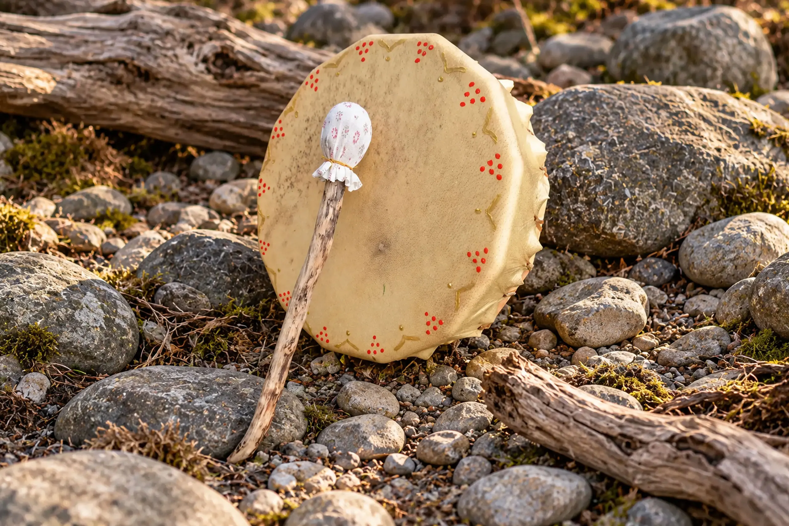
The thirteen-sided emblem draws inspiration from the traditional shape of Stefan’s handmade drums. The number thirteen connects to the lunar cycle and the shamanic traditions associated with his drum-making practice. This gives the emblem a meaning that reaches beyond its appearance, connecting the visual identity to a distinctive part of his craftsmanship.

One identity, multiple expressions.

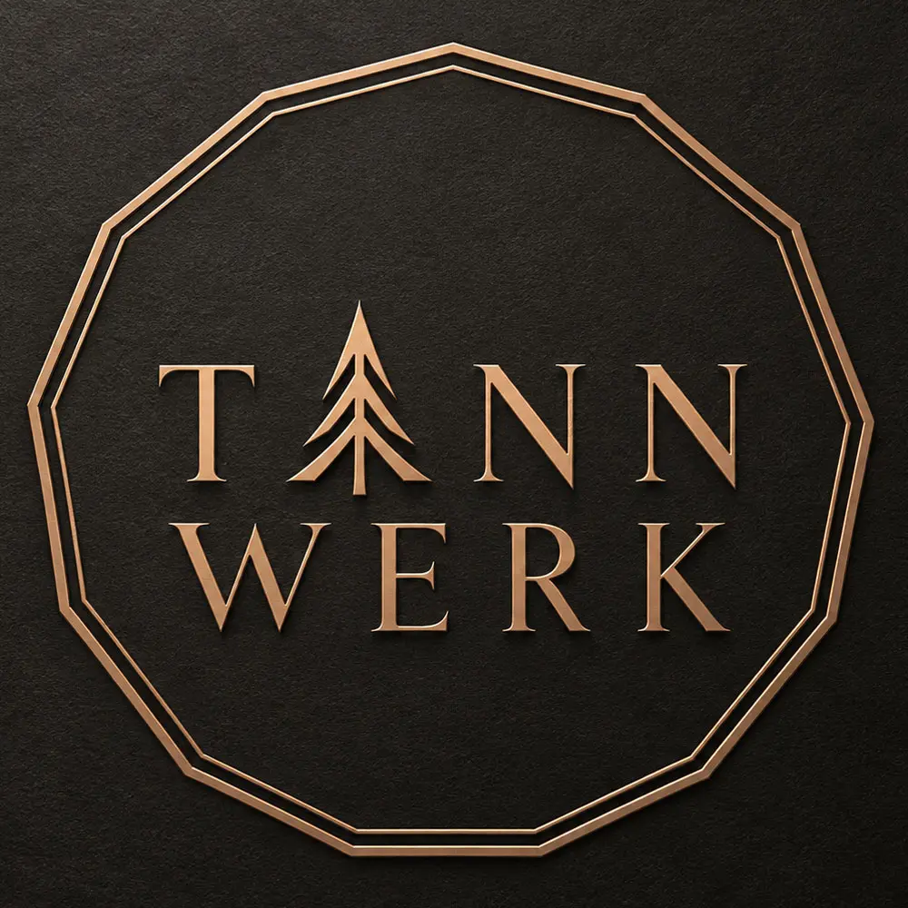
The resulting logo combines a refined wordmark, the integrated fir-tree symbol and the thirteen-sided frame. Light and dark versions allow the identity to work across different backgrounds, while the copper-toned three-dimensional relief translates the design into a tactile, material expression. The standalone fir-tree symbol is also used as the favicon, retaining the identity in its most reduced form.

The result is a visual identity rooted in Stefan Tanner’s name, the material he works with and the traditions behind his craft.
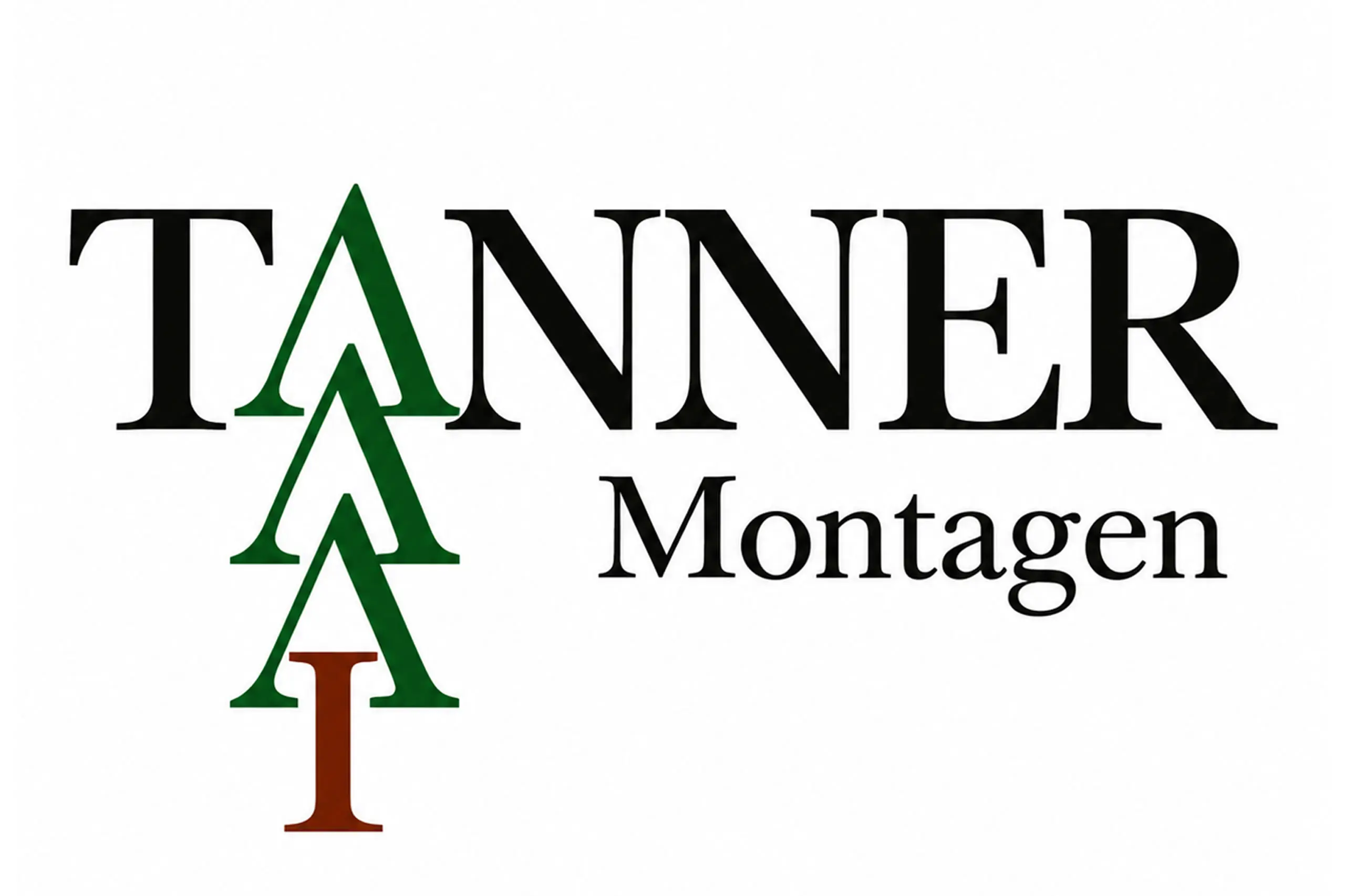
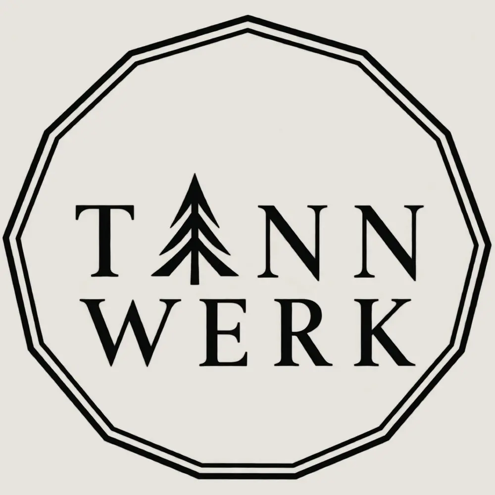
Original Tannwerk logo
01 — OLD LOGO
Light version of the Tannwerk logo
02 — LIGHT LOGO
Dark version of the Tannwerk logo
03 — DARK LOGO
Three-dimensional Tannwerk logo relief in a copper finish
04 — 3D RELIEF
Tannwerk fir-tree symbol used as a favicon
05 — FAVICON
06 STORYTELLING

A story told through image, movement and content.

Instead of presenting information as isolated sections, the new website connects content, imagery and movement to create a more cohesive story. The result is an experience that communicates not only what Tannwerk does, but also the craftsmanship, materials and atmosphere behind it.

07 ART DIRECTION

A more refined visual world.

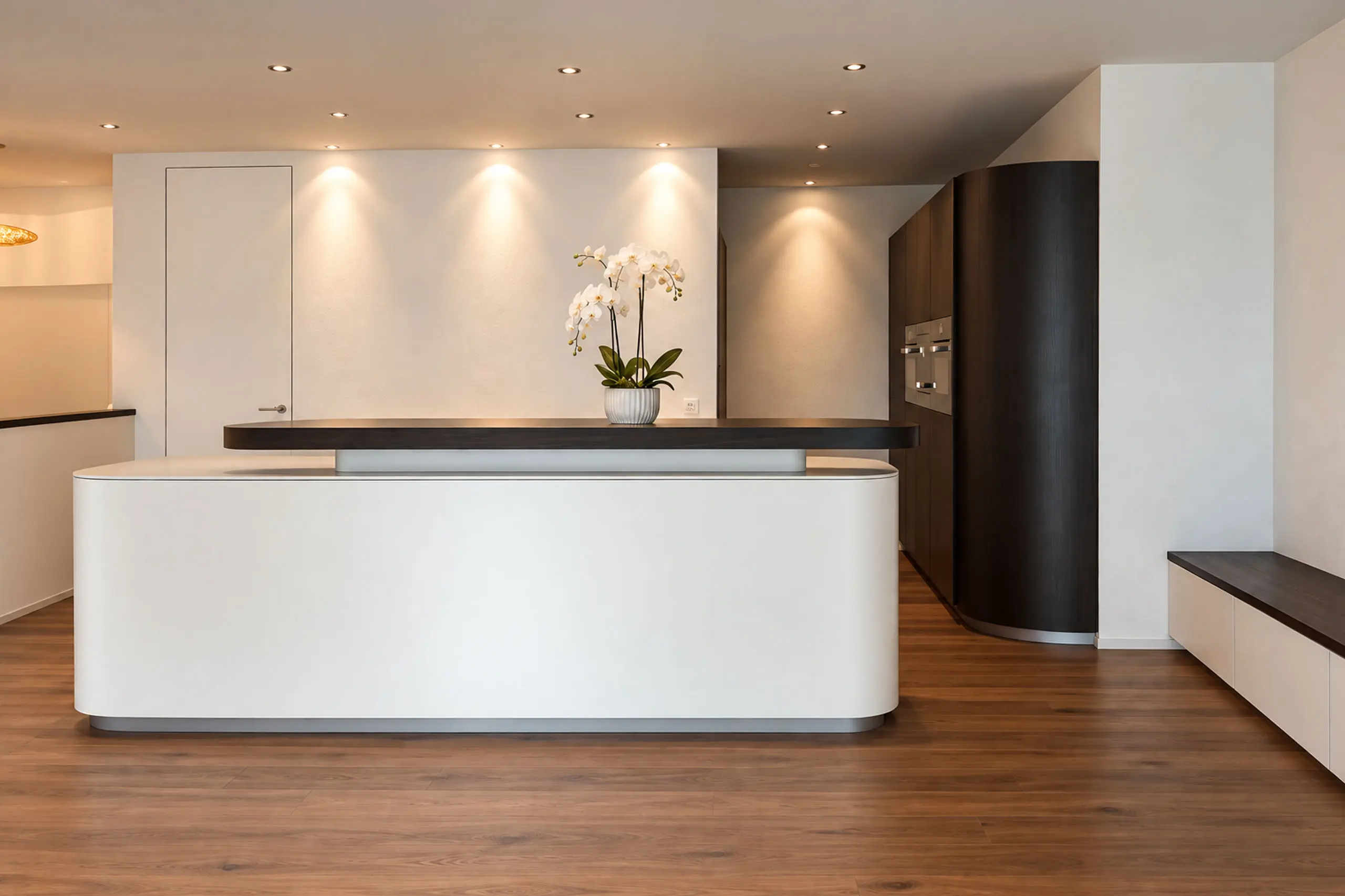
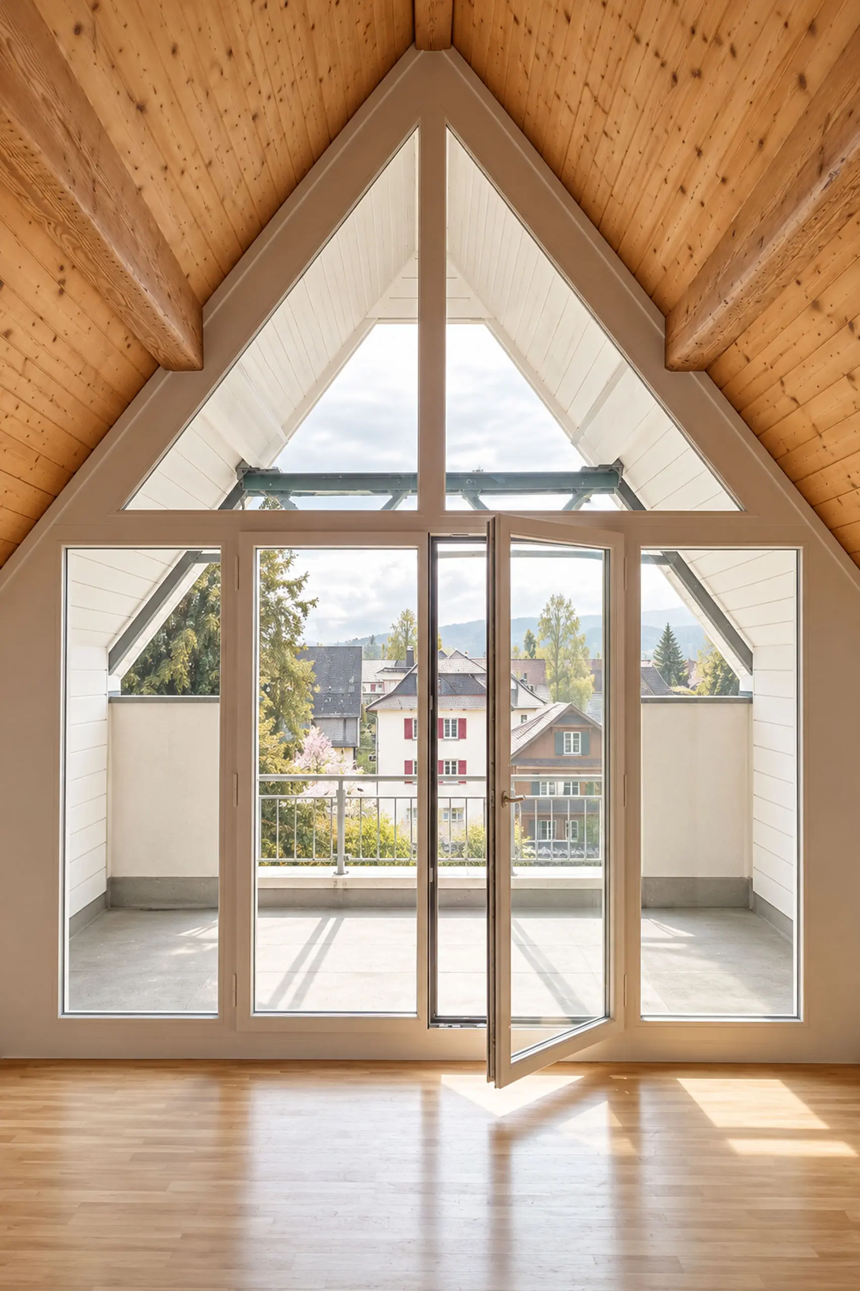
Photography became an integral part of the new visual identity. Carefully selected and professionally edited imagery creates a consistent visual language across the website, while each world retains its own atmosphere and character.

08 MATERIAL & CRAFT

From explaining the work to making it tangible.

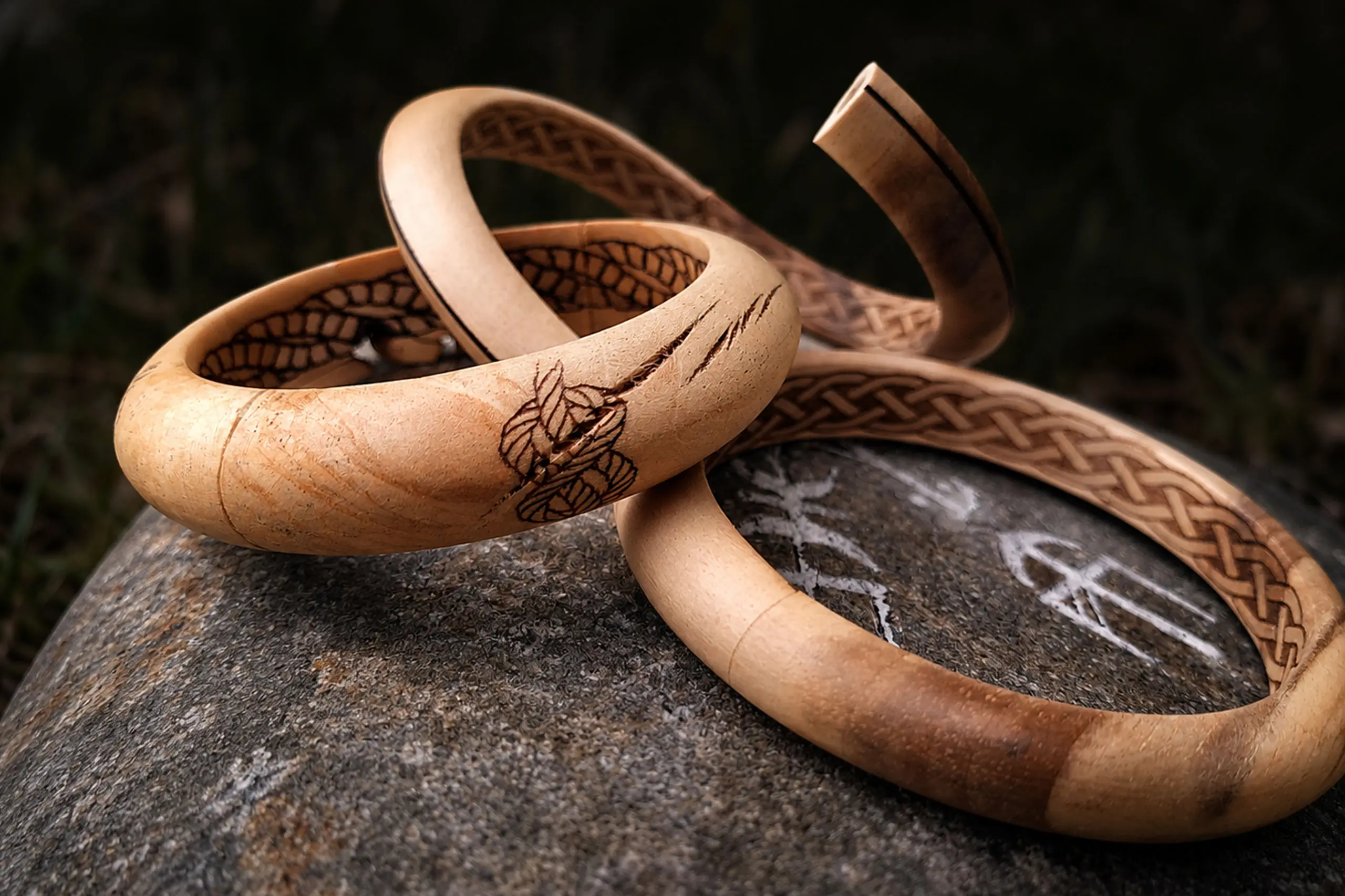
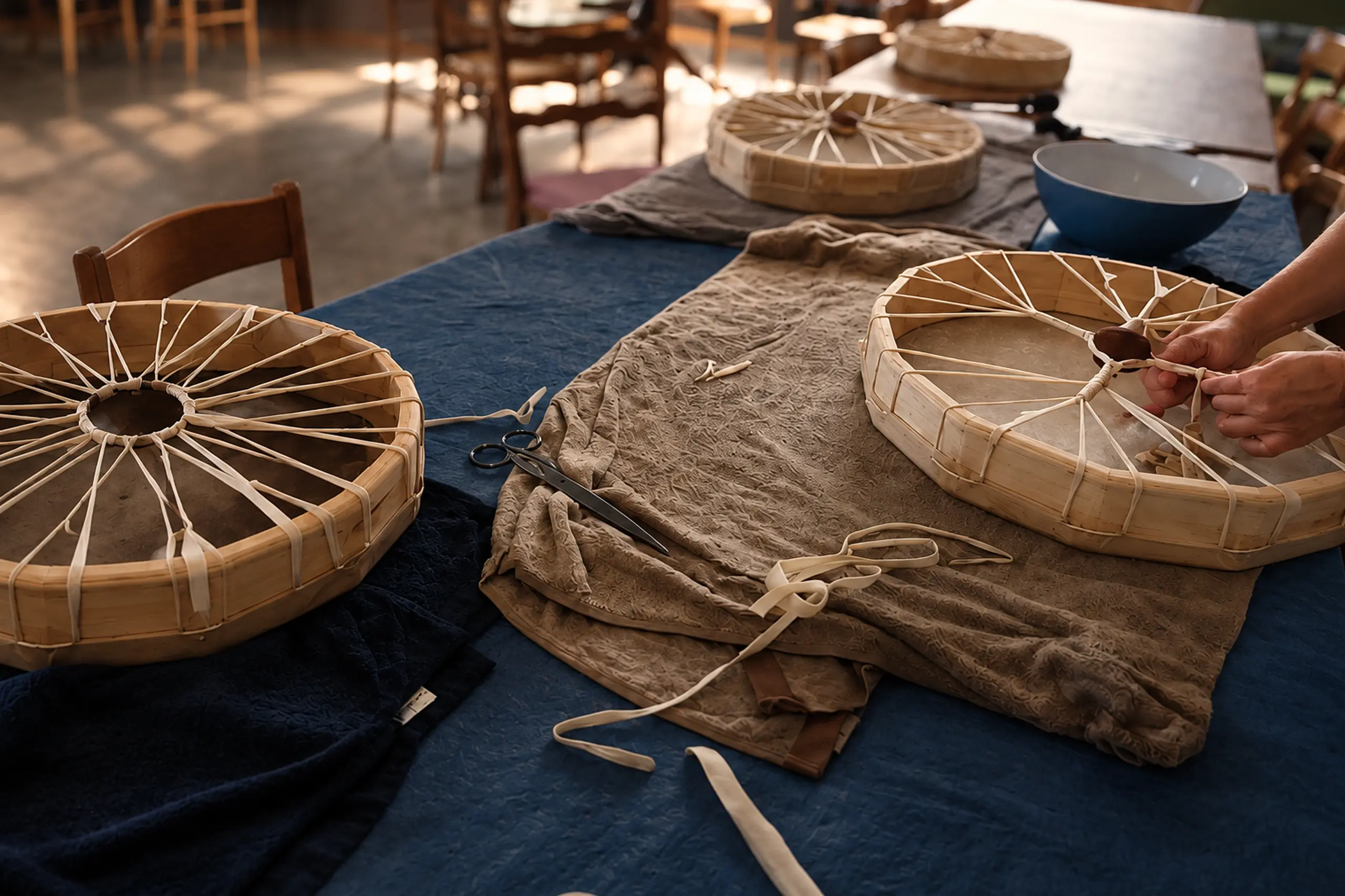
The new website puts the focus on the materials, craftsmanship and experiences behind Tannwerk. From handcrafted products and individual details to the drum-building workshop, imagery and content make the work more tangible and give visitors a better sense of what Tannwerk is about.

09 RESPONSIVE

A considered experience on every screen.

The new website was designed to adapt seamlessly across desktop, tablet and mobile. Layouts, typography, imagery and interactions were carefully adjusted for smaller screens, preserving the character and usability of the experience without simply scaling down the desktop version.

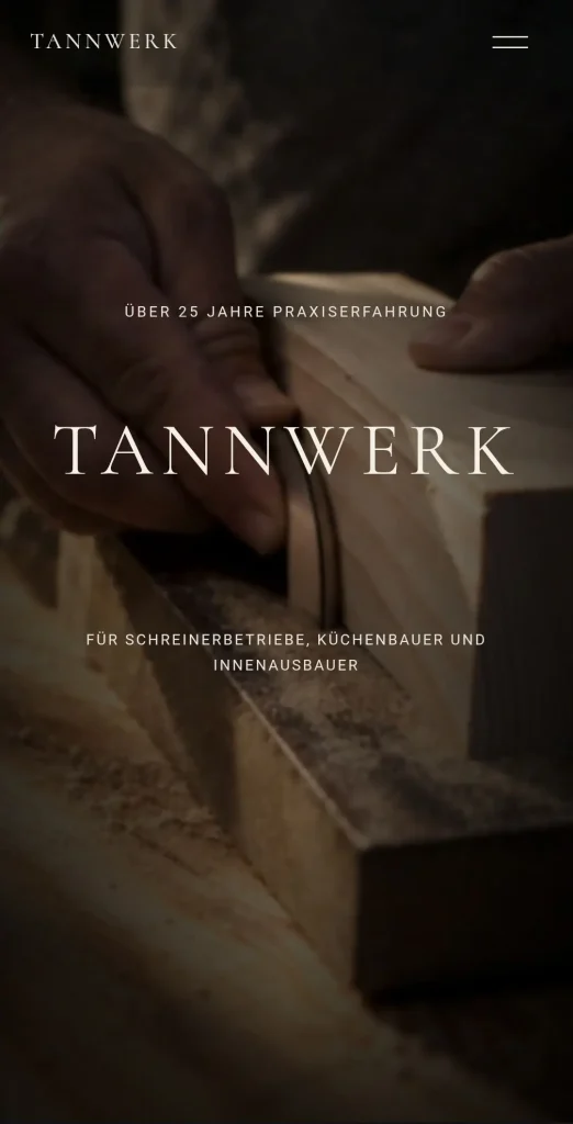
Tannwerk Website auf Smartphone – responsives Webdesign von EF Webdesign
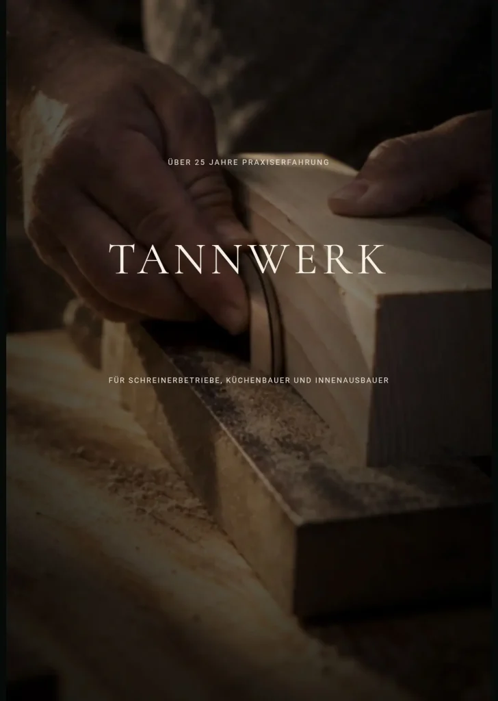
Tannwerk Website auf Tablet – responsives Webdesign von EF Webdesign

Previous

8-ung-steil

Next

Elena Frizler Photography

Scroll to Top
STUDIO

A web design studio creating thoughtful digital experiences — for businesses, brands and people with a story worth telling.

ELSEWHERE
INSTAGRAM ↗
EF Webdesign

Send your enquiry

Your project details have been added automatically. Tell us a little more and we’ll get back to you.
Your project
Project type
—
Project size
—
Additional needs
—
From us
—
Estimated duration
—
Estimated investment
—
STUDIO

Ein Webdesign-Studio für durchdachte digitale Erlebnisse – für Unternehmen, Marken und Menschen mit einer Geschichte, die es wert ist, erzählt zu werden.

EF Webdesign

Anfrage senden

Your project details have been added automatically. Tell us a little more and we’ll get back to you.
Dein Projekt
Projekttyp
—
Projektumfang
—
Zusätzliche Funktionen
—
Zusätzliche Leistungen
—
Geschätzte Dauer
—
Geschätzte Investition
—